Here is your PAC Global Leadership Awards Nominee Roundup! Each week we will be featuring five of the fantastic nominees, leading up to the ONEof100 Summit on February 18, 2020 where the winners will be announced.
CHAMPAGNE COMPTES DE DAMPIERRE
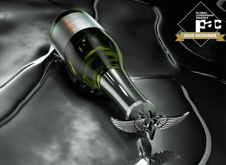
This design was created as a limited-edition piece to commemorate the Dampierre x Bentley collaboration. Inspired by the Flying B mascot from the Iconic Bentley models of the 30’s and 40’s, a sleek, modern structure crowned with the iconic vintage winged B ornament was designed, bringing to life this unique piece of Bentley Motors history. The Limited Edition stopper is beautifully showcased in an elegant grey box, which opens to reveal a bold red interior. The design reflects cues from both brands, Bentley Motors and Dampierre, and appeals to luxury customers who appreciate heritage, craftsmanship and quality.
I+I BOTANICALS
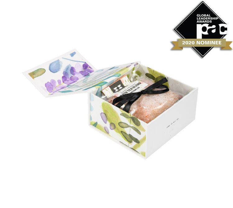
I+I’s magnetic boxes are designed for various display options and spaces, and can sit on store shelves open, closed, upright, or stacked. The packaging magnets inside the box structure enhances the consumer’s sensory experience, as it produces a crisp, satisfying “pop” when snapped shut. To combat breakage and overpackaging, we designed a custom box structure using recyclable cardboard materials. Inside the box is a perfectly sized cutout for our recyclable glass bottles, and magnets positioned inside the box frame to keep the bottle secured.
MOLSON
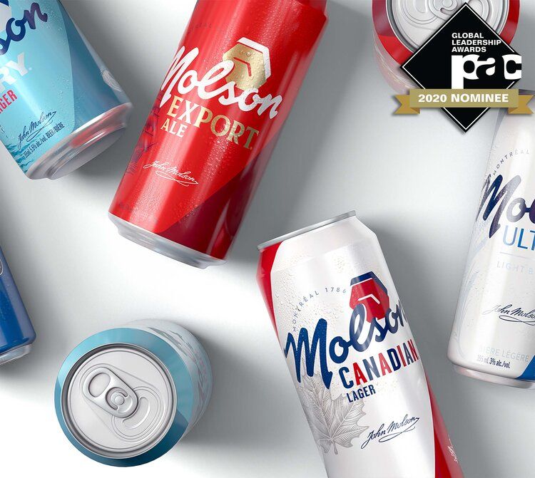
At the heart of the new identity is a freshly inked interpretation of John Molson’s signature, with a clock relating back to the first one which sat on North America’s oldest brewery in Montreal. The brand is held together by clear and consistent pack hierarchy; including a bold and dynamic new Molson identity, the sub-brand/variant iconography with quirks, followed by the descriptor. This clear structure enables consumers to navigate easily at shelf. Finding both the brand they are looking for, but also introduce them to new sub-brands they may not have considered within the portfolio.
EVOLUTION OF SMOOTH
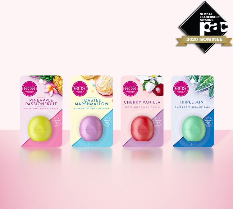
The Eos redesign uses heroic ingredient images to unify the brand across all pillars and to stand out amongst its competitors. Each pillar has a differentiated look & feel that appeals to a variety of needs and will make it easier for consumers to navigate the product line. A new iconography system was developed that is playful and true to the brand’s tone of voice, but still clearly communicates the product claims and the brands commitment to natural and ethically sourced ingredients. The use of the diagonal is innovative and disruptive at shelf, while the color palette is fresh, flavorful and fashion forward.
WITHER HILLS
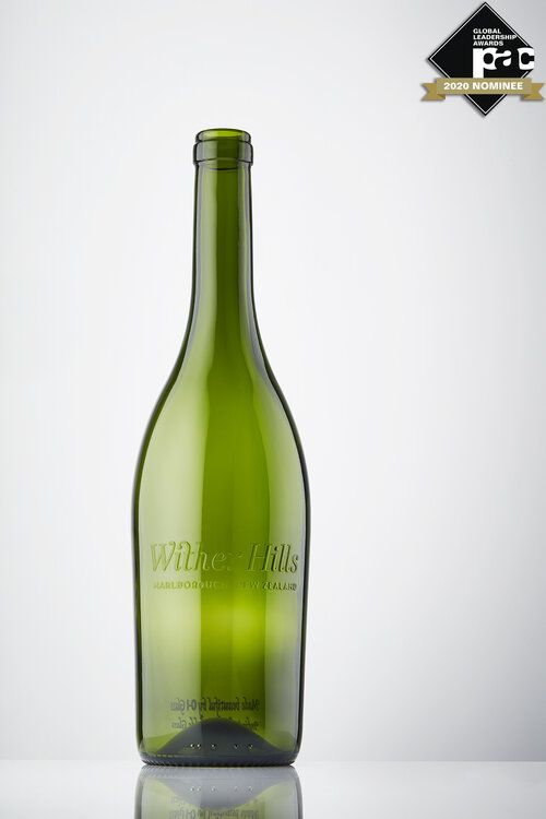
This glass customization technology, shown here with the Wither Hills brand, offers customers the opportunity to create highly personalised and customised glass packaging at flexible volumes, industrial speeds, and affordable value with a wide variety of colour and design possibilities. These capabilities are expanded by a premium version of the service, which enables brands to apply customised tactile digitally printed effects, including embossing and coloured embossing with speed and ease.
