Welcome to the PAC Global Awards Nominee Roundup! Each week we will be featuring five of the fantastic nominees, leading up to the ONEof100 Summit on February 18, 2020 where the winners will be announced.
COMPLIMENTS
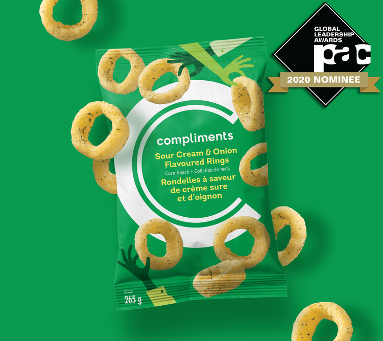
The design team created a nimble visual system that can be applied across a variety of categories and retail banners. The bold C graphic and lively colour palette were designed to jump off the shelf and provide a strong brand block in over 25 categories. Quirky illustrations weave product stories and make inclusivity the heart of the story.
ELITE
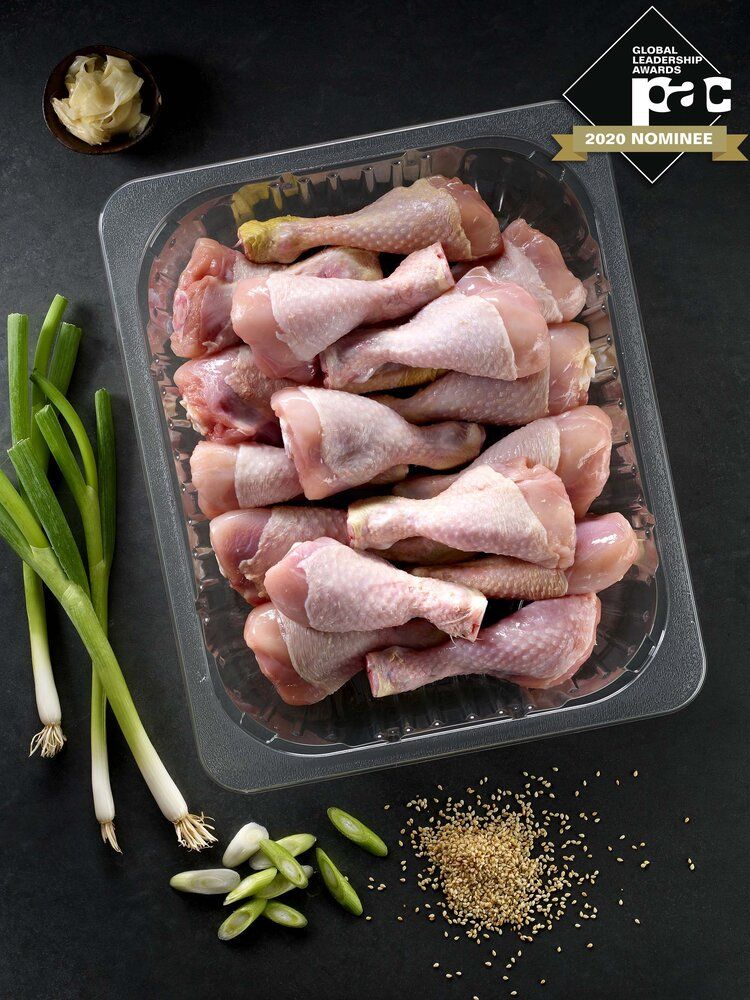
Elite® was developed as the ultimate solution for protein packers in search of a sustainable tray for modified atmosphere packaging (MAP) applications. The patented sealing technology hermetically seals the product which ensures that the product stays safe and secure, reduces leak rates and reduces food waste. Elite will yield 100% crystal clear PET when recycled which is a breakthrough in tray packaging design and a huge benefit to the recycling industry. The #1 Recycle mark and the “Made from 100% recycled PET, recycle me where possible” label offers the consumer and brand the peace of mind that they are buying and offering a socially responsible product.
YOUR FRESH MARKET
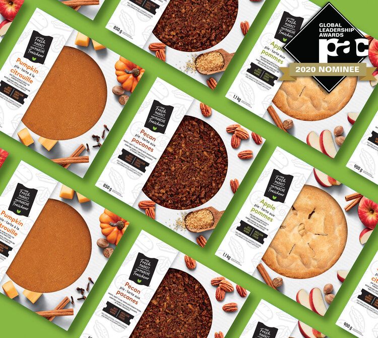
The new Your Fresh Market design reflects the simplicity and pleasure of everyday meals and allows the food to be the true hero. YFM uses visual simplicity and punches of colour to attract attention to key pieces of information on pack – getting to what the consumer needs to know as quickly and easily as possible. The punchy colours and tag graphics help outline SKU specific features and the background creates a billboard of simple hand-drawn illustrations.
HERBAL ESSENCES
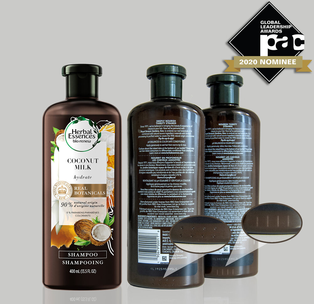
As part of the laser marking process, Herbal Essences are displacing material creating peaks and valleys that are acting as a sensory system to deliver feedback to the consumer on which product they are interacting with. The objective of this development was to enable consumers who are blind and/or those with low vision to identify the difference between Shampoo & Conditioner products, improving the in-shower experience. The inclusive design elements are unique to any other package in market.
BLANTON’S 2018 LIMITED EDITION PACKAGING
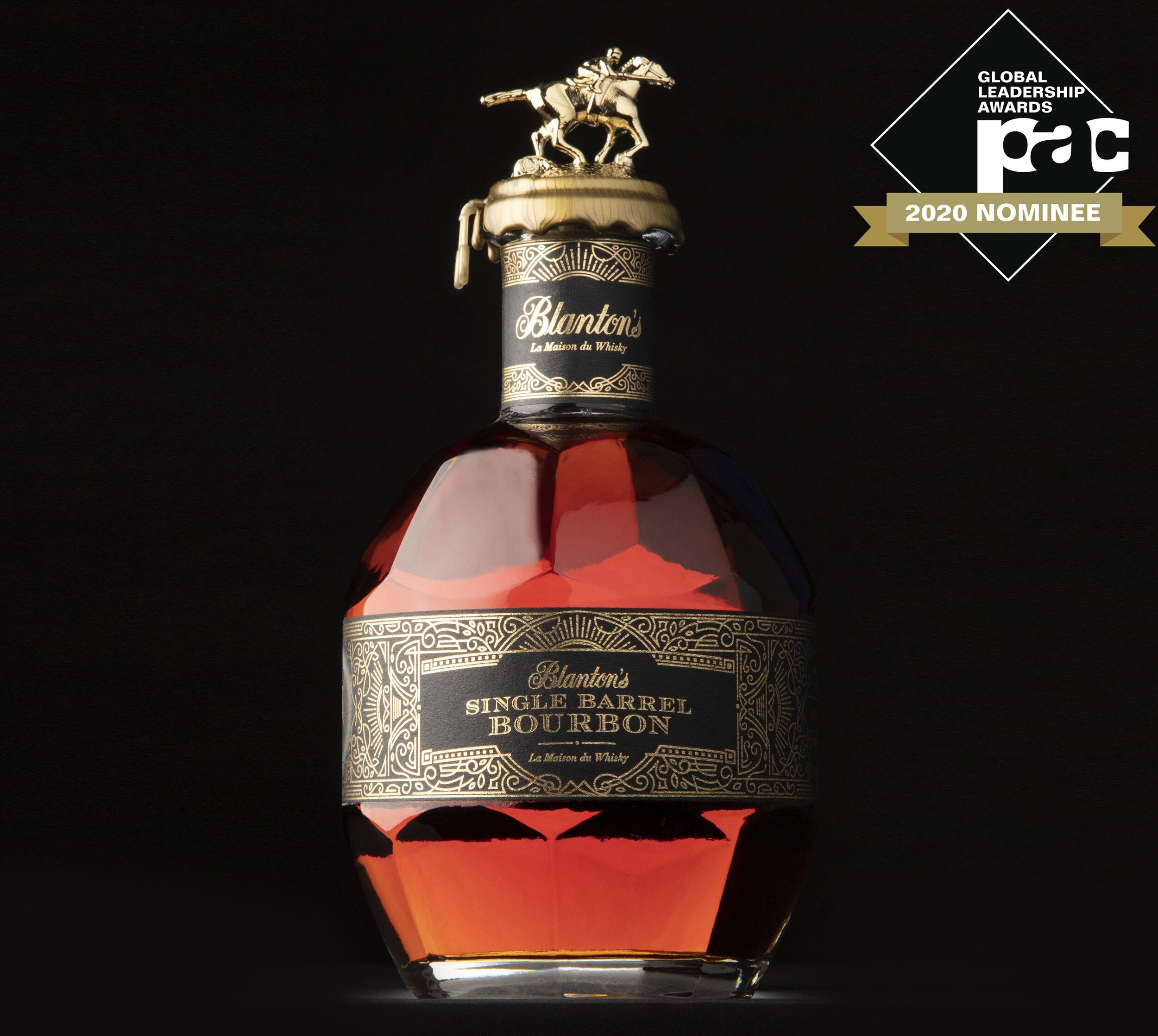
Blanton’s Bourbon was looking to reinvent its exclusive offering for La Maison du Whisky, and needed to create a new, premium look that would be sought after by collectors. Knowing the target was primarily French, the team developed a series of cultural context overlays to identify those things that Blanton’s Bourbon, Kentucky, and Paris have in common – including horse racing, architecture, historical associations, and turn-of-the-century gilded style. Where previous offerings of this nature prioritized a low-involvement project and process, this new expression of the package actually increased Blanton’s desirability.
