Here is your PAC Global Leadership Awards Nominee Roundup! Each week we will be featuring five of the fantastic nominees, leading up to the ONEof100 Summit on February 18, 2020 where the winners will be announced.
WAYFARE
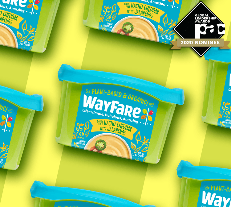
Wayfare’s mantra, “Eat amazing, Live amazing, Feel amazing” speaks to the brand’s passionate outlook, which inspired this rebrand. The creative solution aimed to breathe life into the brand, updating the holistic identity to feel more vibrant and approachable. WayFare was designed to stand out against the competition with a deep teal and a vibrant green that are not often seen in grocery. The rebrand also involved a new design and structure, both of which are trend-setting and unexpected in the category, but still give a nod to the inner meaning.
COLD FX
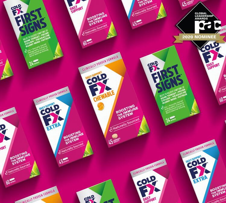
COLD-FX needed to find a new audience in a growth category and transform itself to become the modern fighter immune booster of choice. The creative solution evolved the brand mark to feel contemporary, bold and energized – much like its consumers! The graphics, inspired by the brand mark, creates strong blocking at shelf that draws attention and helps it to stand out as a trustworthy brand.
CREEMORE
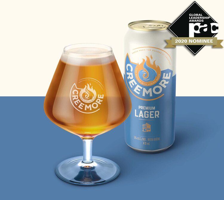
As a beer with real substance and history, the visual identity of Creemore embodies the core values of looking to the next chapter, awakening opportunity and celebrating the future. These come together within the copper kettle and circular blue ribbon, a nod back to the brands previous visual id, as well as a forward arrow referencing the idea of reinvention. The brand line ‘fresh from the village of Creemore’ and ‘Fire brewed with Spring water’ brings an element of story-telling.
PAMPERS
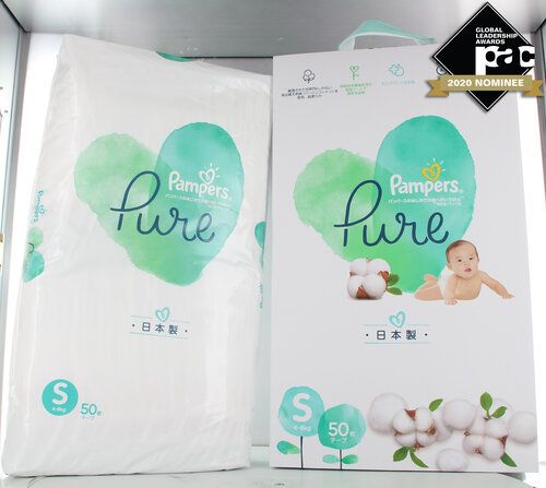
Pampers Pure is the first bag-in-carton handcrafted execution consisting of a polyethyelene bag as the primary package to contain the diapers providing dust containment and moisture barrier. To elevate the premium feel, the primary bag is contained in an elegantly designed white carton box coated with soft touch varnish, and handcrafted teal and white satin ribbon handles are integrated at the top of the carton box. The whole packaging of Pampers PURE is a handcrafted packaging experience executed with excellence.
FONTAINE FAMILY
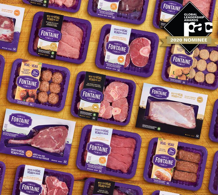
The brand name Fontaine Family was developed to resonate to French and English speaking markets and to connect with active young adults and parents who look for great quality and ready-to-cook meat/meal solutions. The brand visual identity is prominent and vibrant purple colour helps to stand-out at shelf. The see thru window allow to see freshness, the most important purchase driver. Fresh and vibrant colour, new design style and approach for meat to express the distinctive offer: responsibly raised animals, transparency, high quality, delicate and lean meat.
